Data visualization is the act of taking information (data) and placing it into a visual context, such as a map or graph.
Data visualizations make big and small data easier for the human brain to understand, and visualization also makes it easier to detect patterns, trends, and outliers in groups of data.
Good data visualizations should place meaning into complicated datasets so that their message is clear and concise.
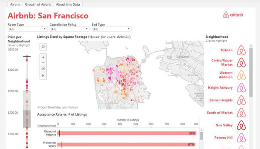
http://tangyidesign.com/tableau-airbnb-la-data-visualization-1
Types of Visuals
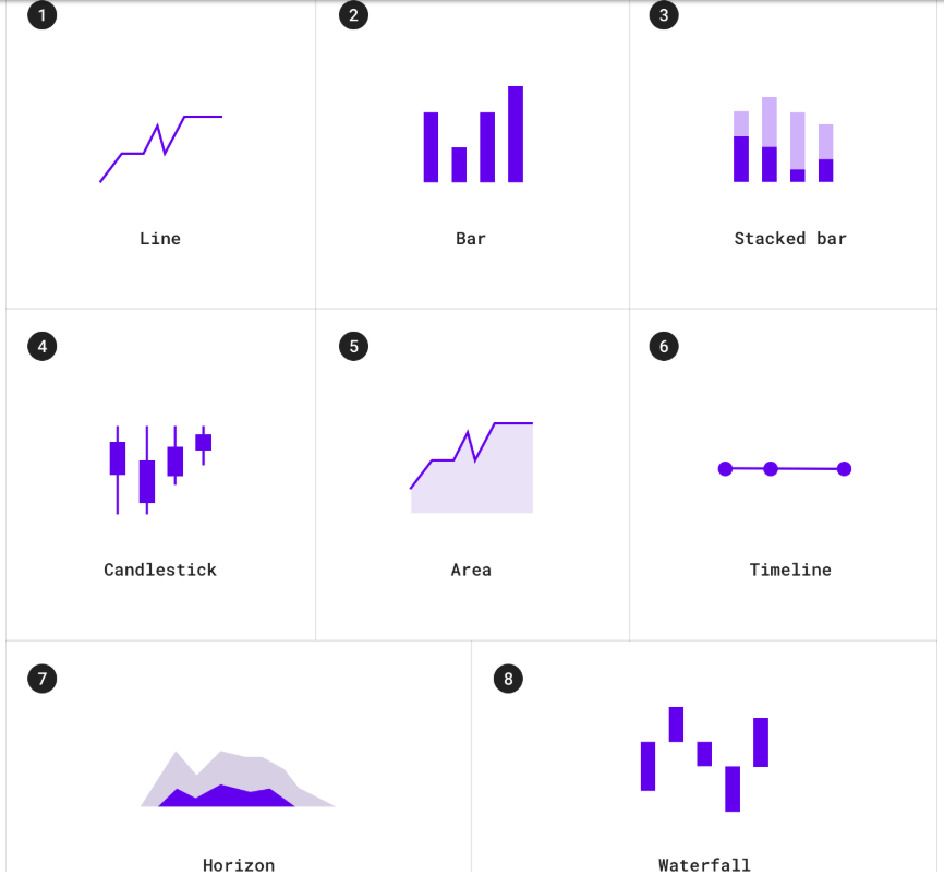
In the early days, the easiest and most common way to create a data visualization was to take the information from an Excel spreadsheet and transform it into a bar graph, pie chart, or table.
Nowadays you also have the option to create more intricate visualizations such as:
- Bubble clouds.
- Bullet graphs.
- Heat maps.
- Radial trees.
- Infographics.
- And more.
First, you want to make sure you have a clean and complete set of data to work with. If there are holes in your numbers, they will be reflected in your visualization.
You don’t want any elements of the graph to take away or distract from the data. The data and the visual need to work together to tell a story.
The Importance of Data Visualization
We are an inherently visual world, where images speak louder than words. Data visualization is especially important when it comes to big data and data analyzation projects.
Nowadays more and more companies are using machine learning to collect mass amounts of data. While it’s great that they’re able to do this so quickly and effectively, it also calls for a way to sort through, comprehend, and explain this data in a way that makes sense to both the business owners and stakeholders.
The same concept applies to advanced data analyzation projects.
When data scientists are in the midst of a complex project, they need a way to understand the data that’s being collected so that they can monitor and tweak their process to ensure it’s performing the way it should.
The results from complex algorithms are much easier to understand in a visual format as opposed to lines and lines of text and numbers.
Data visualization is truly important for any career; from teachers trying to make sense of student test results to computer scientists trying to develop the next big thing in artificial intelligence, it’s hard to imagine a field where people don’t need to better understand data.
“[data visualization is] one of the most useful professional skills to develop. The better you can convey your points visually, the better you can leverage that information.”
Data Visualization & SEO ( Search Engine Optimization )
Anyone who has worked with SEO knows that it can be difficult to explain to those unfamiliar with the field, but it’s challenging even to seasoned experts to explain and understand the results from Google Analytics, Google Ads, Keyword Planner, and more.
Creating SEO visualizations will not only make the data more accessible to you and your stakeholders, but it will also save you time and make it easier to identify trends in the optimization process.
“There are a lot of different elements that affect organic traffic, [and] it is sometimes difficult connecting all the dots during the optimization process. Using SEO visualization, however, allows you to connect the dots and find out whether a new link earned had an effect on traffic and rankings if PPC traffic is performing better than organic traffic, and which keywords created leads that turned into actual sales.”
By putting it into a graph, table, or other types of visualization, you’ll easily be able to look at a large amount of information at once and hopefully see trends among your competition that you can then apply to improve the success of your own business.
DATA VISUALIZATION Tools
https://fdl.design.blog/2019/10/18/tools-for-data-visualization/
