+ Duration | Fall 2017 (3 mos), HCDE Information Visualization
+ My Role | Research, Ideation, High-fidelity Prototyping
+ Methods | Interview, Persona, Usability Testing, Tableau Data Visualization
+ Sector | Real Estate
+ Team | 3 Members
PROBLEM
Airbnb is known for its core philosophy of connecting people and culture by providing a residential-space sharing platform. However, through the interview and data exploration, we noticed a drastic gap between the ratio of the Entire Home listings and Shared Room listings.
“When using Airbnb, I want the most localized experience possible. But it has been getting harder and harder…”
—Participant’s quote
GOAL
We wanted to create a trend-exploration tool in helping people efficiently constructing their travel experience & encourages the participation into the sharing economy.
SOLUTION
Introducing AirbnbShare
An Interactive Data Visualization that Helps You Construct Your Ideal Trip
If you are a traveller who is looking for the most immersive local experience with the best value, AirbnbShare is for you.
RESEARCH
We interviewed 6 participants to learn about their Airbnb experience, and what they are curious about Airbnb dataset. The interview findings lead us to 2 types of potential users: travellers who wants to live like locals, and general investors.
Through further market research, we found many existing tools that have already coved the most needs of general investors, while the topic of “Immersive Trip” is barely touched. The interesting gap led us to look at the sharing culture behind the data in LA.
DESIGN
Ideation & Data Exploration
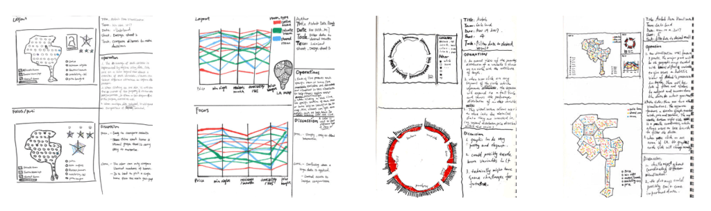
Following the research, we began sketching and designing our first iteration following Five Design Sheets guidelines.
Prototyping & User Testing
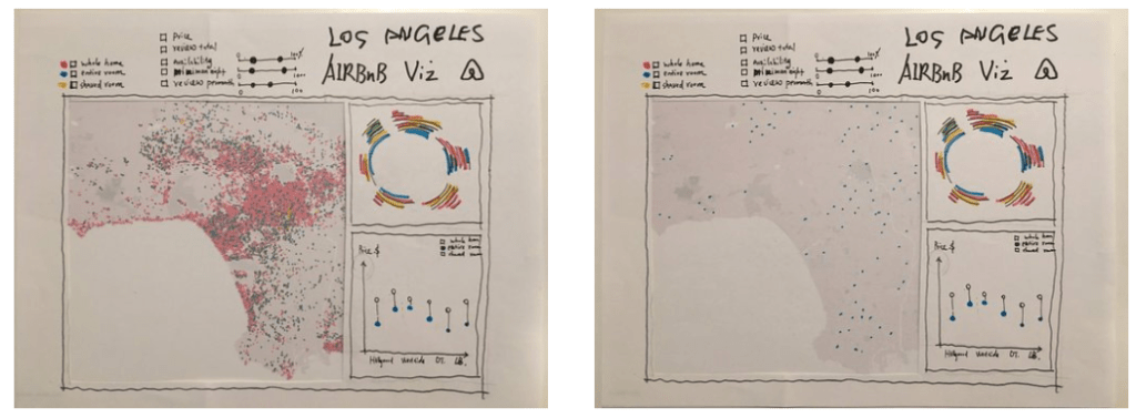
Round 1 Paper Prototypes
The initial paper prototype concept contained a dashboard of 3 different kinds of visualizations: a map of all listings by Los Angeles neighbourhoods, a circle of the distribution of different type of room by each neighbourhood, a chart of the comparison of sale price and Airbnb price by neighbourhoods.
Round 1 User Testing Findings
After this in-class evaluation, we found that a several of these visualizations were difficult for viewers to understand and explain. In addition, too many filters actually confused the users, and prevented users from exploring these visualizations.
Pros
- The map design is straight-forward, and visually appealing
- The position & length attributes used in the bar chart is effective
Cons
- Too many information & filters
- Colors among graphs are coflicting that cause confusion
- The data may be distorted after being normalized
Next Step
- Change the radial graph to parallel coordinate
- Limit to 3 filters to control the map
- Add rearrange function
