Ankit Peshin, Sarang Gupta, Ankita Agrawal
12/10/2018
Introduction
We are a team of three – Ankit Peshin, Sarang Gupta, and Ankita Agrawal. We present here our exploratory data analysis, visualizations, interactive plots, animations and lots of other interesting insights into the Airbnb data. We focus on New York City’s data, for the very reason that we live in New York and second, we wish to perform an in-depth analysis on one of the most densely populated cities in the world.
Following are a few questions that we aim to answer through our analysis:
- How do prices of listings vary by location?
- How does the demand for Airbnb rentals fluctuate across the year and over years?
- Are the demand and prices of the rentals correlated?
- What are the different types of properties in NYC? Do they vary by neighborhood?
- What localities in NYC are rated highly by guests?
- What makes a host Super host?
- Do regular hosts and super hosts have different cancellation and booking policies?
- Are there any common themes that can be identified from the free-text section of the reviews? What aspects of the rental experience do people like and what aspects do they abhor?
The project is available on Github:https://github.com/Ankit-Peshin/airbnb.git
Contributions
All of us had a deep sense of teamwork and communicated well with each other. We were successful in acknowledging and appreciating each other’s efforts while at the same time corrected each other along the way. As a team, we invested a lot of time in discussing and brainstorming ideas – from selecting the dataset to compiling the final version of this report.
The work was divided such that each of us worked on equally difficult and challenging tasks. To highlight a few contributions, Ankita worked on word cloud to derive meaning from customer reviews, led the development of the listings locator and along with Sarang was instrumental in giving a general structure to our analysis, making sense from the chaos. Ankit introduced word embeddings to analyze review data, and worked on the Shiny app to filter listings and another one to build a wordcloud of similar terms. Sarang produced a cool animation showing the rise in the number of Airbnb rentals in NYC over the years, and performed some interesting time-series investigation.
Static visualizations were also distributed such that each one of us gets to work with the entire data set and thus be able to help with issues faced by other team members and accelerate productivity. It was a highly collaborative effort where our work went through a review process and Github’s version control was convenient.
Description of Data
The data is sourced from the Inside Airbnb website http://insideairbnb.com/get-the-data.html which hosts publicly available data from the Airbnb site.
The dataset comprises of three main tables:
listings– Detailed listings data showing 96 atttributes for each of the listings. Some of the attributes used in the analysis areprice(continuous),longitude(continuous),latitude(continuous),listing_type(categorical),is_superhost(categorical),neighbourhood(categorical),ratings(continuous) among others.reviews– Detailed reviews given by the guests with 6 attributes. Key attributes includedate(datetime),listing_id(discrete),reviewer_id(discrete) andcomment(textual).calendar– Provides details about booking for the next year by listing. Four attributes in total includinglisting_id(discrete),date(datetime),available(categorical) andprice(continuous).
A quick glance at the data shows that there are:
- 50,968 unique listing in NYC in total. The first rental in NYC was up in April, 2008 in Harlem, Manhattan.
- Over 1 million reviews have been written by guests since then.
- The price for a listing ranges from $10 per night to $10,000(!) per night. Listing with $10,000 price tag are in Greenpoint, Brooklyn; Astoria, Queens and Upper West Side, Manhattan.
Analysis of Data Quality
We had to perform a few imputations and transformations on our dataset for us to create the desired visualizations. There were no major inconsistencies or mismatches in the data, but most of the columns/features we were interested in did not contain data in the required format and hence were manipulated in a way that their meanings are retained.
A brief analysis of some features:
Key Feature Engineering
comment (reviews): We extensively used this feature in our analysis. The dataset contained reviews in multiple languages such as Chinese, Spanish, and English which made it difficult for it to be analyzed. We subsetted the data to include only the reviews that were in English and performed text filtering to remove common stop words and phrases that do not significantly contribute to the meaning of the review.
2.price (listings, calendar): The price column contained data in string format with the currency symbol ‘$’ and comma separator ‘,’ attached to it. This column was manipulated to contain integer values for time-series and other analysis.
date (calendar, listings, reviews): The date was contained in mm-dd-yyyy format. It was transformed multiple times during the analysis to obtain weekly, monthly or yearly insights.
4): rating (listings): There are several ratings that hosts receive including ‘location rating’, ‘cleanliness rating’ and ‘overall rating’. Values in these columns comprised of percentages, integers, and char string. Data were standardized and transformed to a similar scale.
Sampling Data
The comments feature in the reviews datasets constituted of more than 1 million values. To conduct a textual analysis on the review, it had to be split into a bag of words which would contain more than 20 million words. Due to computational limitation, we randomly sampled the ‘reviews’ dataset to contain 30% of the original observations.
Dealing with Missing Values
The data also had null values. To preserve all the information, we imputed or dropped the rows and columns containing null values while conducting exploratory analysis that made use of these features.
We construct a visna plot to analyze the missing values for the variables that we would be using in our exploratory analysis.
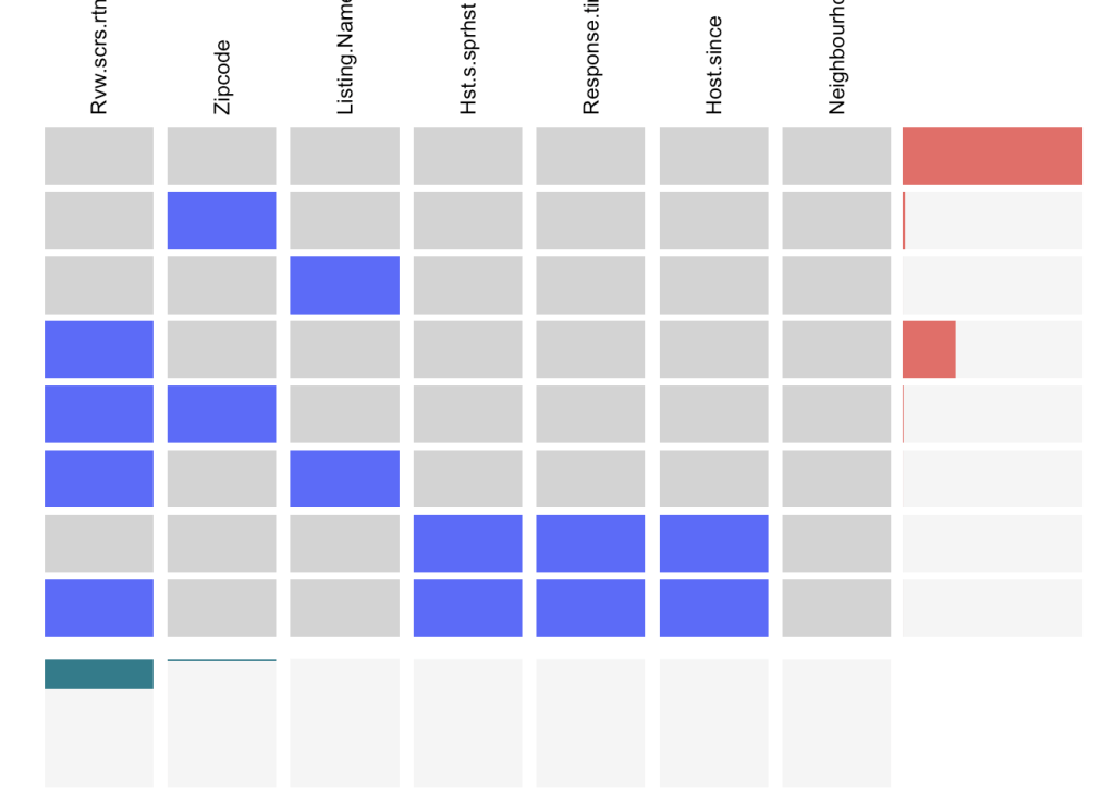
Few observations from the plot:
- Most of the rows have no missing values.
review_scores_ratingvariable is missing from almost 30% of the rows.zipcode,listing_name``,host_response_time,host_since, andhost_is_super_host“` have missing values in few rows and hence they are not reflected in the bar graph on the right.
We can conclude from the above plot that the Airbnb dataset contains only a few NA values which further helps us argue that the analysis done on this data is performed without much loss of information.
Exploratory Data Analysis
In this section, we will detail our analysis to the questions of interest mentioned in the introduction and gain preliminary insights through exploratory data analysis and visualization. We have divided it into four subsections that aim to answer the questions through a variety of different visualization.
- Spatial Data Analysis
- Demand and Price Analysis
- User Review (Textual Data) Mining
- Other Interesting Insights
Spatial Data Analysis
This section will explore various variables from our dataset using spatial visualizations and will answer questions relating to variations in prices and ratings across different locations in NYC.
Link to the animation http://sarang-gupta.000webhostapp.com/listingAnimation.html
This is the basic interactive graph with all the listing in New York City appearing in a clustered fashion. You can click on clusters to see the listing it comprises. This gives a zoom-in view. You can further click on each listing to see details like Listing Name, Host Name, Price of the property, Property Type, Room Type. This visualization helps to explore every listing geographically. It gives the overall sense of how the listings are distributed across neighborhood. We can see from the map that maximum listing are clustered around Manhattan and Brooklyn region, followed by Queens, Bronx and the least number of listing are in Staten Island.
Airbnb users (customers) rate their stay on the basis of location, cleanliness and a host of other parameters. Here we work with the location score data. It would be interesting to see the average location scores for each neighbourhood. The location scores have to be a firm indicator of the appeal of the neighbourhood. Highly rated neighbourhoods will tend to have better connectivity (subway stations), will tend to be closer to the city hotspots (Times Square, Emire State, Wall Street).
The graph confirms our theory and some more. Manhattan receives the highest location scores for the downtown region (esp below Central Park). In Staten Island, the areas close to the State Park have the highest location scores. Brooklyn neighbourhoods close to Manhattan tend to have higher location ratings. Looking at the NY subway system in Brooklyn, it is interesting to observe that the highly rated areas correspond with subway line presence. The same is true for Bronx where subway lines do not go.
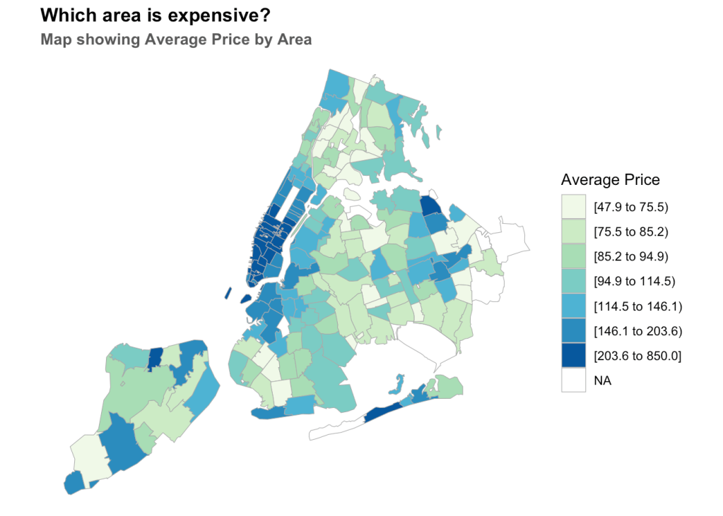
This map follows from our previous location ratings by neighbourhood map. Now it is obvious that the highly rated location would also tend to be costly (demand vs supply). This graph would be a good opportunity to put our previous results to test.
Again downtown Manhattan is the clear winner when it comes to high rents, as is true for the neighbourhoods of Brooklyn close to Manhattan. The East Village area in Downtown Manhattan is a clear outlier, where both rents and location scores tend to be lower than its surrounding regions. It would be interesting to conduct 2 studies – i). Find high rating – low rent regions (best of both worlds) : The State Park region in Staten Island (discussed in the previous graph) is one such region where rents tend to be fairly low despite having the highest location rating. Another such sweet-spot lies to the North East of Brooklyn. ii). Find low rating – high rent regions (worst of both worlds) : The Elm Park region of Staten Island has disproportionately high rents, yet very low location scores. Other such locations can be found towards the Northern Bronx regions.
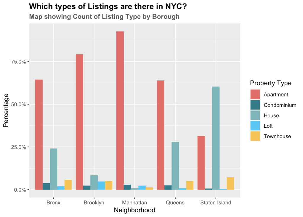
Through visualization, we wish to study the relationship between property type and neighbourhood. The primary question we aim to answer is whether different boroughs constitute of different rental types. Though there are more than 20 types, we will be focussing on the top 5 by their total count in the city and understanding their distribution in each borough.
The plot shows the ratio of property type and the total number of properties in the borough.
Some key observations from the graph are
- We can see that Apartment style listings are highest in number in all four neighborhoods except Staten Island. Staten Island has more ‘House’ style property than ‘Apartments’. This analysis seems intuitive, as we know that Staten Island is not that densely populated and has a lot of space.
- The maximum apartment style listings are located in Manhattan, constituting 90% of all properties in that neighborhood. Next is Brooklyn with 75% Apartment style listing followed by Queens with 60% apartment style.
- Queens and Bronx also have a lot of House style listings. Queens constitute 25% House style properties, which is greatest after Staten Islands.
- Loft style properties are also common in New York. Brooklyn constitutes of 10% of Loft style listing followed by Manhattan with nearly 7% loft style.
- Staten Island has nearly 10% of Town House listings, as we know that States Island is widely spread. Townhouses are also common in Bronx, Brooklyn, and Queens with nearly 5-7% townhouse style properties listed.
- Condominium styles are most common in the Bronx constituting nearly 5% of its listings.
Demand and Price Analysis
In this section, we will analyse the demand for Airbnb listings in New York City. We will look at demand over the years since the inception of Airbnb in 2009 and across months of the year to understand seasonlity. We also wish to establish a relation between price and demand. The question we aspire to answer is whether prices of listings fluctuate with demand. We will also conduct a more granular analysis to understand how prices vary by days of the week.
To study the demand, since we did not have data on the bookings made over the past year, we will use ‘number of reviews’ variable as the indicator for demand. As per Airbnb, about 50% of guests review the hosts/listings, hence studying the number of review will give us a good estimation of the demand.
How popular has Airbnb become in New York City?
1.The number of unique listings receiving reviews has increased over the years. We can see an almost exponential increase in the number of reviews, which as discussed earlier, indicates an exponential increase in the demand.
2.One can observe that number of reviews/demand also depicts a seasonal pattern. Every year there are peaks and drop in the demand, indicating that certain months are busier compared to the others.
Let us look at monthly demands for each of the years starting from 2014.
The dots in the above graph reflect the number of reviews written on a particular date, which as per our assumption reflects the demand. There seems to be a consistent pattern in how demand fluctuates across the year, which is reflected in each of the graphs shown above. The demand is lowest in January and increases until October, when it begins to falls until the end of the year.
We inferred that this could possibly be due to the holiday season kicking in, with people celebrating Thanksgiving and Christmas at home with their family, leading to a slump in tourism and hence the demand for tourist lodging. To confirm our findings, we surveyed the data from the National Tourism and Travel Office (NTTO) website and observed a similar pattern in number of non-resident arrivals to the US (NYC as the port of entry) across the year. The number of arrivals were the lowest lowest in January, increasing until October and the beginning to decline from November until the end of the year (unfortunately we could not find statistics on the domestic arrivals to NYC).
The data can be accessed through the below link: https://travel.trade.gov/view/m-2017-I-001/index.asp
How is Airbnb priced across the year?
After observing the pattern in the demand, we wanted to investigate whether the prices of the listings follow a similar pattern. To answer the above question, we looked at the daily average prices of the listings acoss the years using the data from the calendar table.
The average prices across listings tends to increase as one progresses along the year and spikes in December. The pattern is similar to that of the number of reviews/demand except in the months of November and December, where the number of reviews (indicative of demand) starts to fall. This seems counter-intuitive as one would expect the price to decrease with a decrease in demand. This could possibly due to the assumption that we made that number of reviews is a reflection of the demand, which might not always be the case.
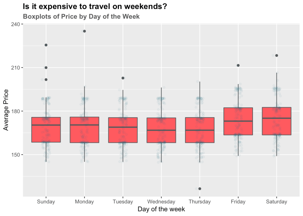
We can also see two sets of points on the above charts which depicts that average prices on certain days were higher compared to the other days. Following, we will plot a box plot of average prices by day of the week to understand this phenomenon.
As we can see, Fridays and Saturdays are more expensive compared to the other days of the weeks, perhaps due to higher demand for lodging.
Occupancy Rate by Month
We will end the analysis of the section by studying how the occupancy looks like for the next year. Using the table calendar, we will find out the precentage occupancy for the next year i.e. as of November 3, 2018 (the date when the data was collected), what percentage of appartments have already been booked. We could not obtain the past data on the occupancy, hence were not able to study what the actual occupancy rates look like.
We believe looking at the occupancy for the next year will also give us good estimation of the seasonal demand.
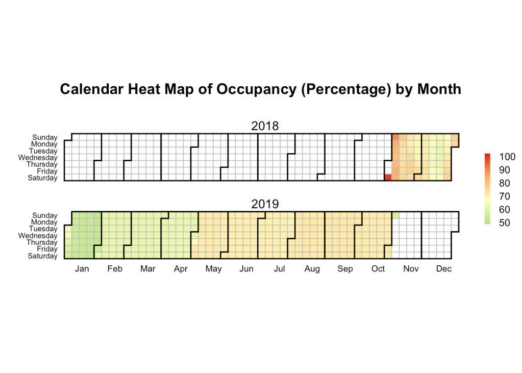
From the above calendar heatmap for 2018 – 2019, we can infer that January tends to be the quietest, and the occupancy rate increases as we progress through the year. This ties up with our results from our analysis of the number of reviews (indicative of the demand) which shows an increasing trend across the year.
User Review (Textual Data) Mining
The dataset provides us with a ton of data, but nothing as insightful and close to the customer as their reviews/feedback. If mined properly, they can tell us a lot about the customer mindset, their expectations and how well those were met. For the final result to make sense, the review text data requires a lot of cleaning – eg. the words need to be stemmed, commas-fullstops-percentages etc need to be removed, common English words and stop words need to be removed etc.
Comment Analysis Using Word Cloud
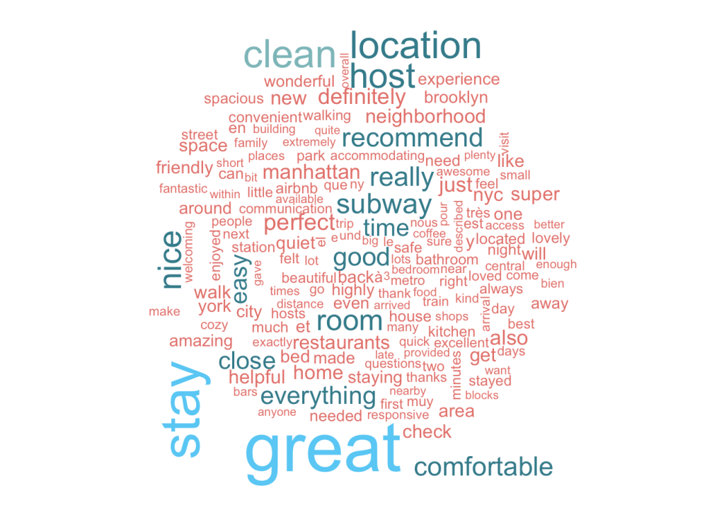
Let us start first with looking at the dominant themes in the reviews; simply building a word cloud should solve this purpose. Wordclouds take a frequency count of the words in the corpus as input, and return a beautiful display of dominant (frequently occurring) words, with their size being proportional to their relative frequency. We have more than a million reviews, so we need to take a random sample of this data, in this case ~30k reviews. While the sampled dataset size may seem very small in comparison to the original, it serves our purpose well because we only need the generic words here. Future analysis on “positive” and “negative” reviews needs more data as we’ll see in the next section.
An analysis of the word cloud shows interesting trends; Location seems to be key, since the words “neighbourhood”, “location”, “area” are featured prominently in the word cloud. Transport options like “subway”, “walk” also find frequent mention. Airbnbs are short term rentals, yet people seem to lay stress on the comfort aspect of their stay, words like “kitchen” tell us that many folks would rather cook than eat out. Availability of “Restaurants” close by find mention too. Bathrooms and Beds, as expected can be clear deal breakers if not in top condition. The word “Host” finds a lot of mention; indicating the important role that hosts play in shaping the Airbnb experience.
The downloaded binary packages are in
    /var/folders/c4/g56f5b19653cm6vwdvst6jsm0000gn/T//RtmppyVDaX/downloaded_packages
INFO [2018-12-10 23:58:47] 2018-12-10 23:58:47 - epoch 1, expected cost 0.0996
INFO [2018-12-10 23:58:53] 2018-12-10 23:58:53 - epoch 2, expected cost 0.0622
INFO [2018-12-10 23:59:00] 2018-12-10 23:59:00 - epoch 3, expected cost 0.0518
INFO [2018-12-10 23:59:08] 2018-12-10 23:59:08 - epoch 4, expected cost 0.0465
INFO [2018-12-10 23:59:15] 2018-12-10 23:59:15 - epoch 5, expected cost 0.0430
INFO [2018-12-10 23:59:22] 2018-12-10 23:59:22 - epoch 6, expected cost 0.0404
INFO [2018-12-10 23:59:29] 2018-12-10 23:59:29 - epoch 7, expected cost 0.0384
INFO [2018-12-10 23:59:36] 2018-12-10 23:59:36 - epoch 8, expected cost 0.0368
INFO [2018-12-10 23:59:43] 2018-12-10 23:59:43 - epoch 9, expected cost 0.0355
INFO [2018-12-10 23:59:50] 2018-12-10 23:59:50 - epoch 10, expected cost 0.0343
INFO [2018-12-10 23:59:57] 2018-12-10 23:59:57 - epoch 11, expected cost 0.0333
INFO [2018-12-11 00:00:06] 2018-12-11 00:00:06 - epoch 12, expected cost 0.0325
INFO [2018-12-11 00:00:15] 2018-12-11 00:00:15 - epoch 13, expected cost 0.0318
INFO [2018-12-11 00:00:22] 2018-12-11 00:00:22 - epoch 14, expected cost 0.0312
INFO [2018-12-11 00:00:29] 2018-12-11 00:00:29 - epoch 15, expected cost 0.0306
INFO [2018-12-11 00:00:37] 2018-12-11 00:00:37 - epoch 16, expected cost 0.0301
INFO [2018-12-11 00:00:44] 2018-12-11 00:00:44 - epoch 17, expected cost 0.0297
INFO [2018-12-11 00:00:51] 2018-12-11 00:00:51 - epoch 18, expected cost 0.0293
INFO [2018-12-11 00:00:58] 2018-12-11 00:00:58 - epoch 19, expected cost 0.0289
INFO [2018-12-11 00:01:04] 2018-12-11 00:01:04 - epoch 20, expected cost 0.0286
Building Word Vectors from Reviews
The word cloud generated previously does a good job of finding what customers are looking for, but it is very generic. Wouldn’t it be great if we could find what people think of the room sizes? How about seeing what makes customers “uncomfortable”?
Well, not to worry; word vectors come to the rescue. Word vectors simply place any given word in an n-dimensional space; and the proximity of any two words in this vector space is proportional to their “similarity”. We use the review data to construct such a vector space to build a word cloud of similar words, derive interesting insights. The first word cloud is for the word “uncomfortable”. Words similar to “uncomfortable” are usually those that occur in conjunction with it frequently, i.e reasons for the discomfort. The word cloud shows just that – notice words like “cramped”, “crowded”,“small”, “stuffy” and “cluttered” indicating that lack of space is one of the most common complaints. “Hot”, “damp” and “cold” are some of the common temperature issues. “Dusty”, “dirty” and “unclean” surroundings will prompt people to write negative feedback. Many feel “nervous”,“unsafe” and “stressful”; clearly a red flag for future tenants. So, as you can see, word vectors add so much more meaning to our analysis.
Similarly, querying by the keyword “comfortable”, we hope to see things that led to a positive experience. Prominently featured are words like “quiet”, “walkable”, “clean”, “spotless”, etc, again demonstrating the importance of environment, location and cleanliness. Helpful “hosts” and “communication” lead to a comfortable. Cleanliness of linens and the bed size leave an decisive impression.
RShiny WordCloud Generator by Query String
Now that we have seen how insightful word vectors can be, it would make sense to develop a tool that allows you to query any word and generate its corresponding word cloud. Words like “happy”-“sad” can again show us the things that matter most to people. However, more specific queries can also give us a wealth of insights. Querying by the term “amenities” shows some of the popular amenities that people seek (and talk about) : “towels”, “linens”, “kitchenware”, “wifi”, “groceries” (i.e nearby shops for groceries). “Breakfast”” seems to be the most prominently featured meal.
We’ll leave you to further explore the wordcloud!
Other Interesting Insights
In this section we will explore and analyze various features which were not analyzed in other sections. We will answer the following questions in this section:
What makes someone a superhost? Are there any insights about the hosts preferences that can be obtained from missing or empty data? *What insights to other categorical variables in the dataset provide?
What makes someone a superhost?
Airbnb awards the title of “Superhost” to a small fraction of its dependable hosts. This is designed as an incentive program that is a win-win for both the host, Airbnb, and their customers. The superhost gets more business in the form of higher bookings, the customer gets improved service and Airbnb gets happy satisfied customers.
But what does it take to be a Superhost? Airbnb’s site has a set of requirements that must be fulfilled in order to become one. Maintaining a review rate above 50%, a response rate above 90%, etc. Here we investigate our dataset to see how the superhosts perform on two parameters : “Response rate” and “Ratings”. Both these variables range from 0 to 100.
The scatter plot gives a few interesting insights. While most super-hosts are in the high-rating:high-response-rate region, we can also see a few hosts with response rates less than 75% (which violates the 90%+ critera set by Airbnb). This is a very small fraction of the hosts. In terms of Ratings, almost all hosts are rated 80% and above.
With that being said, most Airbnb hosts lie in the high-rating:high-response region, but only a small fraction get to be super hosts. So clearly, becoming a Superhost takes a lot more than high ratings & response rates.
Analyis of Categorical Variables:
In this section, we will analyze the relationship between the different categorical variables in our dataset. The variables that we will be examining are instant_booking, cancellation_policy, and room_type. We believe these features are of great importance to both customers and owners at the time of reservation.
Our goal is to understand owners’ behavior with respect to these policies and examine if there is any correlation existing among the variables. We will also study if regular hosts and super hosts have different policies with regards to instant booking and cancellation.
Below are the key takeaways from the above chart:
- One can observe that the majority of the listings are not available for Instant Bookings. Majority of the ones that are available tend to have a strict cancellation policy.
- Properties that are entire homes or apartments tend to have a stricter cancellation policy compared to private and shared rooms. Intuitively this makes sense as the hosts would want to prevent incurring a huge loss by last-minute cancellations on an entire home/apartment style property booking.
- As the no. of listing for a shared room is very less, we can observe a very thin line on the graph. From the graph, all these lines suggest that the shared room are available for instant booking and have a flexible cancellation policy. This is intuitive, as shared spaces bookings are usually on a need basis, and are often last minute and thus this inference supports our intuition.
- We can observe that owners of shared room spaces are generally regular hosts.
- Lastly, it can also be observed that there are no unique patterns observed between super host and regular host and they seem to display a similar behavior for the features we are inspecting here.
Executive Summary
The Airbnb dataset provides us with a fantastic source to better understand New York’s bustling rental landscape. With over 50k listings registered in the last 9 years, New York has proven to be one of Airbnb’s fastest growing cities. Between 2010 and 2014, as more and more people adopted the use of the internet as a service provider, the number of listings doubled every year. A prediction of 70k listings by 2020 shoudn’t be very far off. Downtown Manhattan and the adjacent parts of Brooklyn had by far the highest concentration of listings. Staten Island and Bronx have been slow adopters. This animation we developed does a good job of visualizing Airbnb’s host network growth.
