Types
Data visualization can be expressed in different forms. Charts are a common way of expressing data, as they depict different data varieties and allow data comparison.
The type of chart you use depends primarily on two things: the data you want to communicate, and what you want to convey about that data. These guidelines provide descriptions of various different types of charts and their use cases.
Types of charts
Change over time charts show data over a period of time, such as trends or comparisons across multiple categories. Common use cases include: Category comparison…READ MORE
Change over time
Change over time charts show data over a period of time, such as trends or comparisons across multiple categories.
Common use cases include:
- Stock price performance
- Health statistics
- Chronologies
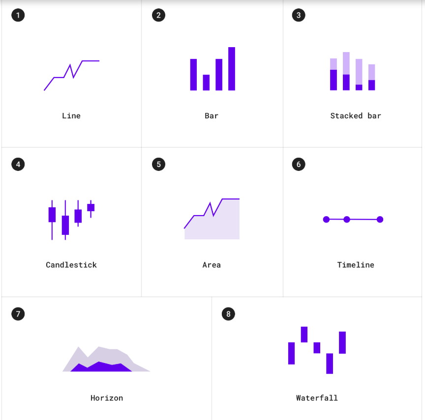
Change over time charts include:
1. Line charts
2. Bar charts
3. Stacked bar charts
4. Candlestick charts
5. Area charts
6. Timelines
7. Horizon charts
8. Waterfall charts
Category comparison
Category comparison charts compare data between multiple distinct categories.
Use cases include:
- Income across different countries
- Popular venue times
- Team allocations
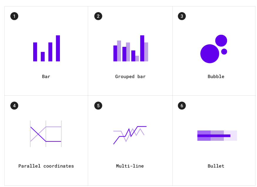
Category comparison charts include:
1. Bar charts
2. Grouped bar charts
3. Bubble charts
4. Multi-line charts
5. Parallel coordinate charts
6. Bullet charts
Ranking
Ranking charts show an item’s position in an ordered list.
Use cases include:
- Election results
- Performance statistics
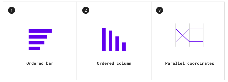
Ranking charts include:
1. Ordered bar charts
2. Ordered column charts
3. Parallel coordinate charts
Part-to-whole
Part-to-whole charts show how partial elements add up to a total.
Use cases include:
- Consolidated revenue of product categories
- Budgets
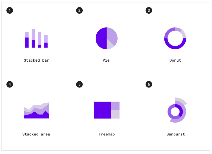
Part-to-whole charts include:
1. Stacked bar charts
2. Pie charts
3. Donut charts
4. Stacked area charts
5. Treemap charts
6. Sunburst charts
Correlation
Correlation charts show correlation between two or more variables.
Use cases include:
- Income and life expectancy
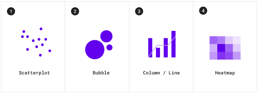
Correlation charts include:
1. Scatterplot charts
2. Bubble charts
3. Column and line charts
4. Heatmap charts
Distribution
Distribution charts show how often each values occur in a dataset.
Use cases include:
- Population distribution
- Income distribution
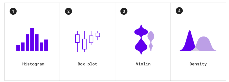
Distribution charts include:
1. Histogram charts
2. Box plot charts
3. Violin charts
4. Density charts
Flow
Flow charts show movement of data between multiple states.
Use cases include:
- Fund transfers
- Vote counts and election results
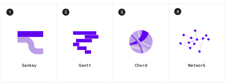
Flow charts include:
1. Sankey charts
2. Gantt charts
3. Chord charts
4. Network charts
Relationship
Relationship charts show how multiple items relate to one other.
Use cases include
- Social networks
- Word charts
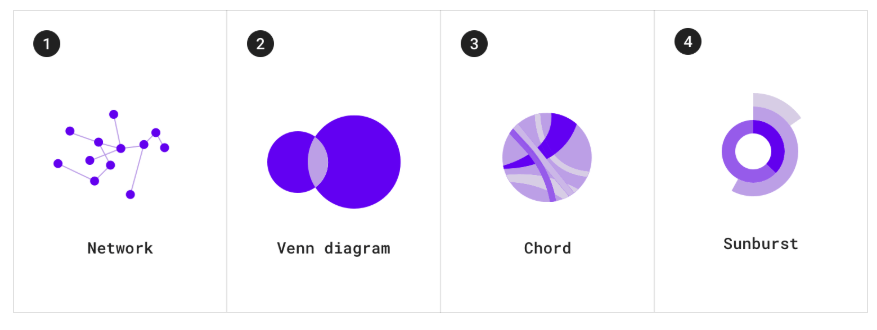
Relationship charts include:
1. Network charts
2. Venn diagrams
3. Chord charts
4. Sunburst charts
