Bar and pie charts
Both bar charts and pie charts can be used to show proportion, which expresses a partial value in comparison to a total value. Bar charts,…
Both bar charts and pie charts can be used to show proportion, which expresses a partial value in comparison to a total value.
- Bar charts express quantities through a bar’s length, using a common baseline
- Pie charts express portions of a whole, using arcs or angles within a circle
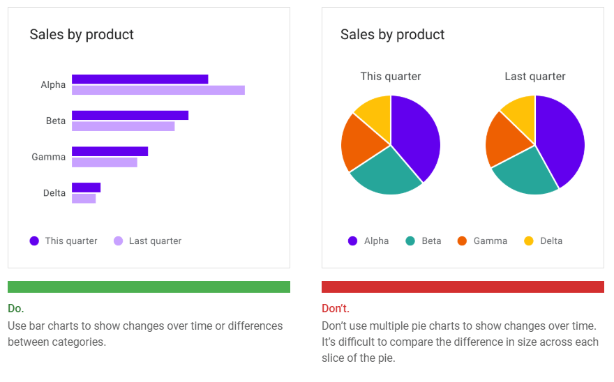
Bar charts, line charts, and stacked area charts are more effective at showing change over time than pie charts. Because all three of these charts share the same baseline of possible values, it’s easier to compare value differences based on bar length.
Area charts
Area charts come in several varieties, including stacked area charts and overlapped area charts: Overlapping area charts are not recommended with more than two time…READ MORE
Area charts come in several varieties, including stacked area charts and overlapped area charts:
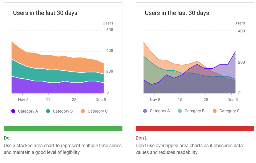
- Stacked area charts show multiple time series (over the same time period) stacked on top of one another
- Overlapped area charts show multiple time series (over the same time period) overlapping one another
Overlapping area charts are not recommended with more than two time series, as doing so can obscure the data. Instead, use a stacked area chart to compare multiple values over a time interval (with time represented on the horizontal axis).
Style
Data visualizations use custom styles and shapes to make data easier to understand at a glance, in ways that suit the user’s needs and context.
Charts can benefit from customizing the following:
- Graphical elements
- Typography
- Iconography
- Axes and labels
- Legends and annotations
Styling different types of data
Visual encoding is the process of translating data into visual form. Unique graphical attributes can be applied to both quantitative data (such as temperature, price,…READ MORE
Visual encoding is the process of translating data into visual form. Unique graphical attributes can be applied to both quantitative data (such as temperature, price, or speed) and qualitative data (such as categories, flavors, or expressions).
These attributes include:
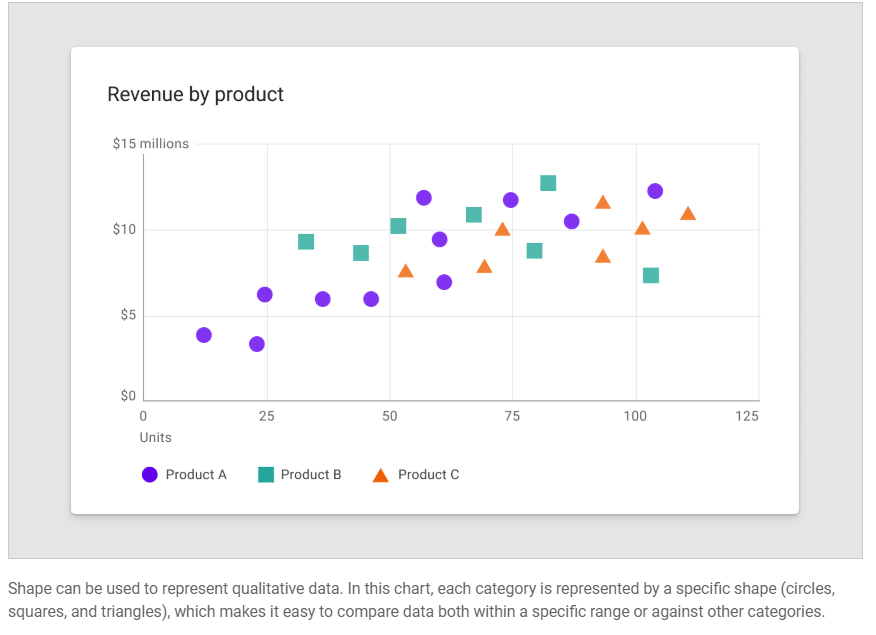
- Shape
- Color
- Size
- Area
- Volume
- Length
- Angle
- Position
- Direction
- Density
Expressing multiple attributes
Multiple visual treatments can be applied to more than one aspect of a data point. For example, a bar color can represent a category, while a bar’s length can express a value (like population size).
Color
Color can be used to differentiate chart data in four primary ways: Color can highlight an area of focus, when it is used sparingly. It’s…READ MORE
Color can be used to differentiate chart data in four primary ways:
- Distinguishing categories from one another
- Representing quantity
- Highlighting specific data
- Expressing meaning
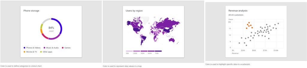
Areas of focus
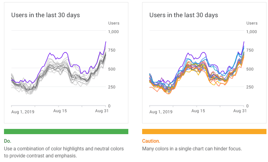
Color can highlight an area of focus, when it is used sparingly. It’s not recommended to use a substantial amount of color highlights, as they can distract and hinder user focus.
Line
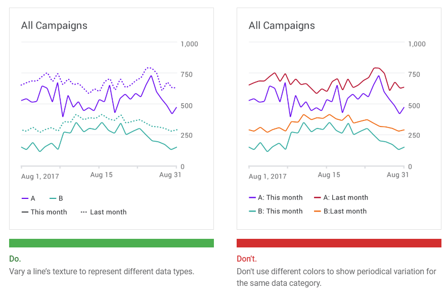
Chart lines can express qualities about data, such as hierarchy, highlights, and comparisons. Line styles can be styled in different ways, such as using dashes…READ MORE
Chart lines can express qualities about data, such as hierarchy, highlights, and comparisons. Line styles can be styled in different ways, such as using dashes or varied opacities.
Lines can be applied to specific elements, including:
- Annotations
- Forecasting elements
- Comparative tools
- Confidence intervals
- Anomalies
Text weight
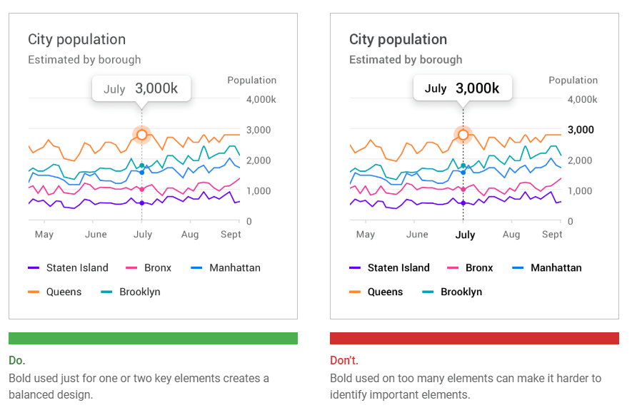
Headings and varying font weights can communicate which content is more (or less) important than other content in the hierarchy. However, these treatments should be used sparingly, with a limited number of typographic styles.
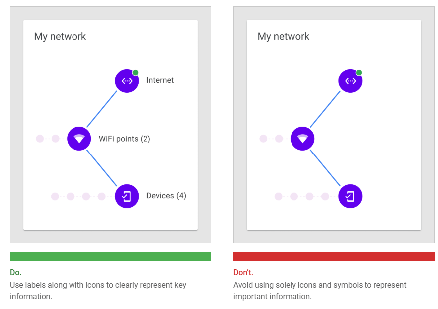
Iconography
Iconography can represent different types of data in a chart and improve a chart’s overall usability. Iconography can be used for: When placing icons in…READ MORE
Iconography can represent different types of data in a chart and improve a chart’s overall usability.
Iconography can be used for:
- Categorical data to differentiate groups or categories
- UI controls and actions, such as filter, zoom, save, and download
- States, such as errors, no data, completed states, and danger
When placing icons in a chart, it’s recommended to use universally recognizable symbols, particularly when representing actions or states, such as: save, download, completed, error, and danger.
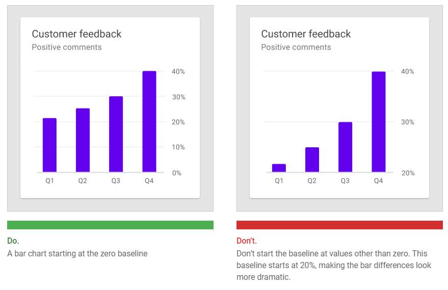
Bar chart baseline
Bar charts should start at a baseline (the starting value on the y-axis) of zero. Starting at a baseline that isn’t zero can cause the data to be perceived incorrectly.
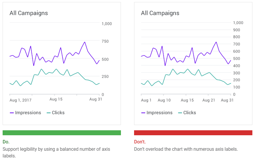
Axis labels
Label usage should reflect the most important data insights in a chart. Axis labels should be used as needed, and in consistent ways across a UI. Their presence should not inhibit reading the chart.
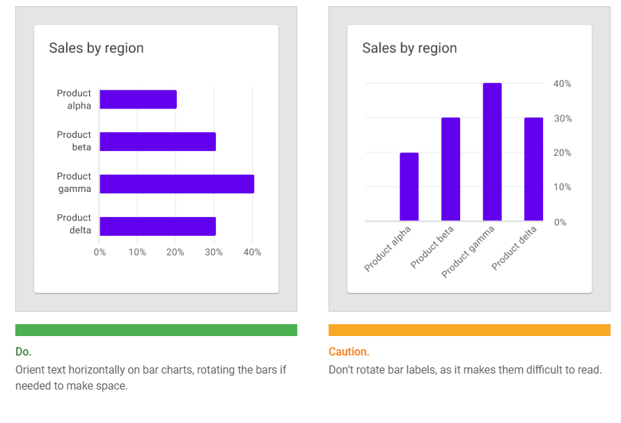
Text orientation
Text labels should be placed horizontally on the chart so that they are easy to read.
Text labels should not:
- Be rotated
- Stacked vertically
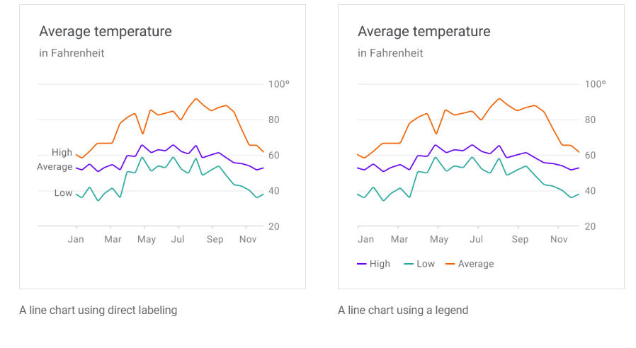
Labels and legends
Chart elements can be labeled directly in simple charts. However, charts that are dense (or part of a larger group of charts) can display labels in a legend.