Round 2 Low-fi Tableau Prototypes
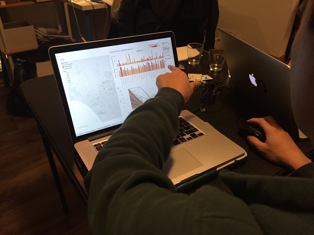
We conducted in-person usability tests for our second prototype. We gave 3 participants (2 male, 1 female) a contextual scenario and asked them to think aloud while they are completing the four tasks through the low-fidelity prototype.
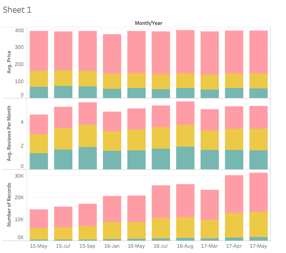
We incorporated the map, bar chart and parallel coordinate into our low-fidelity prototype, and these three interactive visualizations provided users with more information, including the Airbnb’s price vs long-term lease.
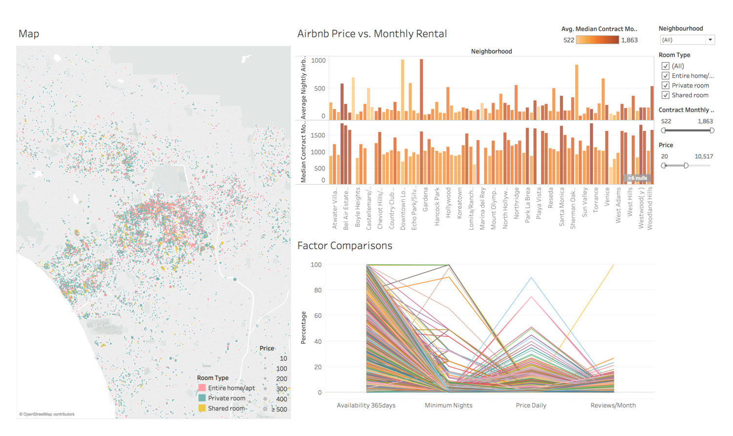
Map: Total Listing Distribution; Bar: Airbnb vs Rental; Parallel Coordinates: 4-factor filter
User Tests
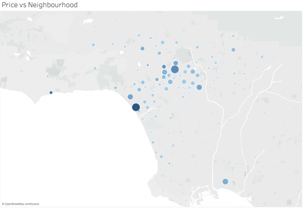
Total Listing Exploration
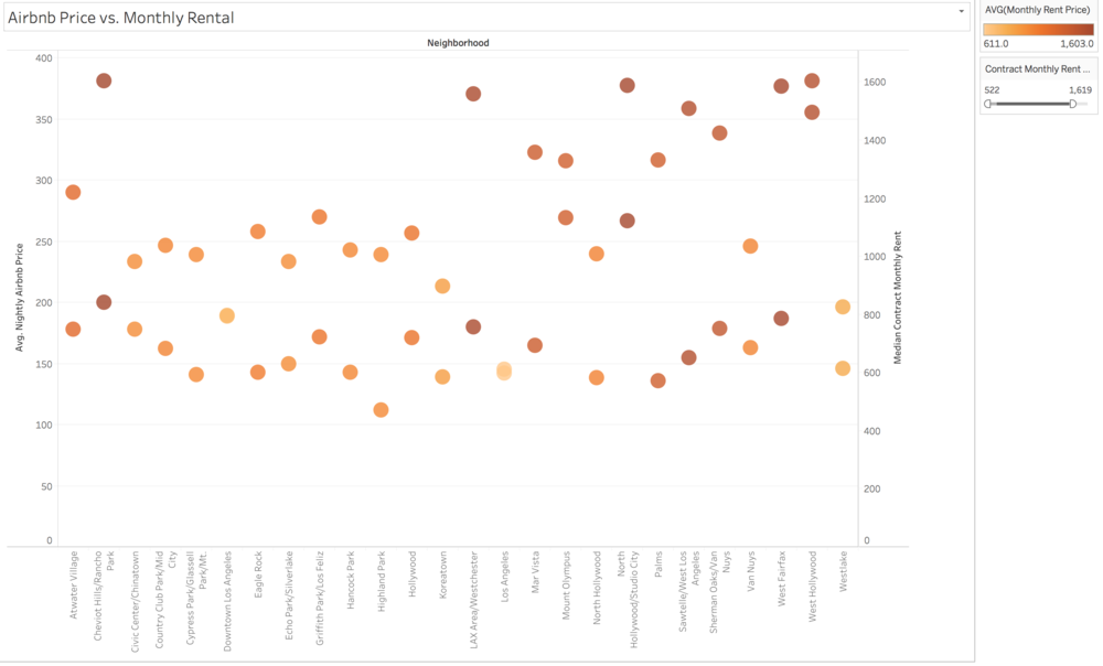
Airbnb vs Rental Exploration
Room Type Exploration
Round 2 User Testing Findings
Pros
- The map listing distribution is easily precieved
Cons
- Too many listings and region data that is difficult to read
- Color choices are confusing and does not reveal trends
- The Brushing filter overall is confusing
- Some category names are misleading
- Filters are not connected to control the whole dashboard
Next Step
- Reconsider the use of parallel coordinates
- Reconsider colors, captions, titles and annotations
- Connect all graphs and redesign the filter for the whole dashboard
https://public.tableau.com/profile/suwei.yang#!/vizhome/LowFiDec3_V161/Dashboard4
http://tangyidesign.com/tableau-airbnb-la-data-visualization-1
